Missing Milla

Last night, I had a dream that I found my beloved cat, Milla, at my friend Jenny's apartment. I was totally confused as to why she was there, but so thrilled to see her. I told her all about our new cat, Leo, and how much her buddy Tyco was going to freak out with glee when he saw her. All the while, I could not figure out why in the heck I'd left her at Jenny's in the first place.

As I was packing her up to leave, however, I realized I was dreaming. My dream self told me that Milla was not at Jenny's and would not be coming home. That she'd passed away two years ago.

When I woke up, I wanted to feel grateful that I was able to hold and pet her all night (even if it wasn't real), but it's not enough. Man, I miss her.
The A. Eric Arctander Grant

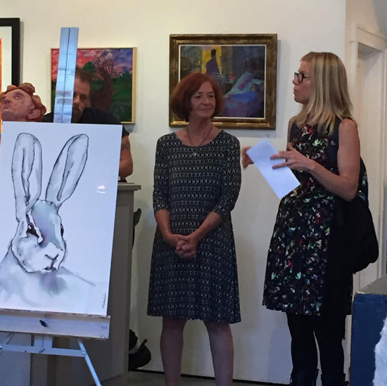
This weekend, I accepted a grant from the Putnam Arts Council, in the name of the late artist A. Eric Arctander. Aside from his beautiful "About" story that you can read here, I knew very little about him when I walked in to the event on Saturday. As I walked around the room, shaking hands and asking questions, I heard various stories about him from people with shining eyes. He was clearly highly revered. It was wonderful. And a tremendous honor.

Eric, I've since read more about you (like this... love!), and I'm sorry that I didn't know you before. Thank you for providing me with this scholarship, and I hope to be as inspiring and encouraging of an artist — and person — that you have obviously been to so many others.

Accepting the A. Eric Arctander Grant.Presented by his beautiful wife, Dell Jones, and the Putnam Arts Council

Accepting the A. Eric Arctander Grant.
Presented by his beautiful wife, Dell Jones, and the Putnam Arts Council

Back to Illustration Friday & drawing with one long line

A few weeks ago, my 8 year old son asked why I only submit collaged work to Illustration Friday — why don't I submit drawings? I'm not 100% sure of my answer for this yet, but I did decide to draw for that week's challenge, which was "Nest."

I went with one of my favorite styles to work in right now, an all-one-line/not-lifting-my-pen drawing. I then cleaned it up a bit in Photoshop and added a subtle blue tone in Illustrator...

Kendra Shedenhelm's "Nest" for IllustrationFriday.com

Illustration Friday, "Nose"

For this week's Illustration Friday's challenge, "Nose," I used my watercolor paintings as my collage material. It was my first time doing so, and I really liked incorporating both of my techniques into one. I definitely plan to explore this further.

I call this piece Portrait of a Woman with Flowers.

MATS Bootcamp and The Hierophant

MATS Bootcamp for May was really fun for me.  

First, Lilla assigned us the "mini" assignment which had us looking at medieval styles in both art and lettering. I found this super cool site in my search: http://www.bl.uk/manuscripts/, and I drew extensively. (You can check out some of my drawings on Instagram here: https://www.instagram.com/kendrasred/)

The final assignment was to create a tarot card that correlates with our birthday. I'm a Taurus, and my card was The Hierophant. Again, I drew a lot, and then began a collage. This was my final submission...

My second illustrated cookbook now available!

I've completed illustrations for another cookbook written by Melissa Fouch Machowski of M Delish Boutique, and it is now available for purchase

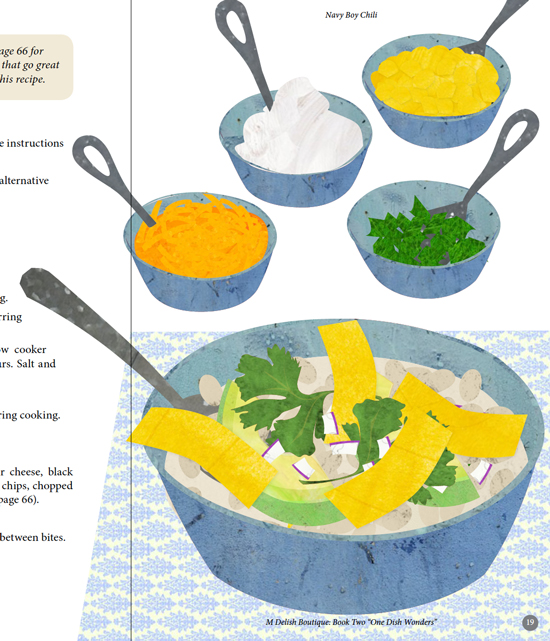
One Dish Wonders is personable and enjoyable to read, and its smaller size and spiral binding gives it that old school/potluck-y feeling that I love. I think it would make a great gift, and Melissa has spice kits and other stuff available to package with it.  

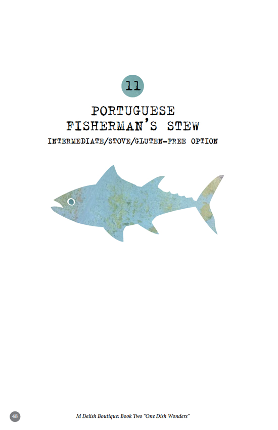
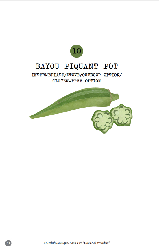
I'm really proud of this one, and I hope you check it out. More info can be found at mdelishboutique.com. Below are a few screenshots from the book...

Another submission to Mark Mitchell's Guest Group Critiques

If you're an illustrator (working or aspiring) and you haven't heard about Mark Mitchell's Guest Group Critiques, I highly recommend checking it out: http://guestgroupcritiques.com/


This month's assignment/critique is with children's literary agent and artist's rep Nicole Tugeau of Tugeau2 Illustration. You can check out her assignment here: https://www.youtube.com/watch?v=QILCl_CU6Ow.

Nicole chose 15 of the approximately 50 submissions to critique on May 24th, and I'm very grateful that mine was one of them! Here's my submitted sketch below. Off to work on the final!

First assignment with MATS Bootcamp 2016

I enrolled in another year of Lilla Rogers' Make Art That Sells Bootcamp. Previous years' assignments have included creating art for a phone cover, illustrating an online editorial, and making a holiday plate/paper collection. I find that MATS Bootcamp is an exceptional way to try new materials and markets, and the class has really helped to develop my portfolio. 

Lilla starts all of her course assignments with a "Mini." This is a just-for-fun exercise, which includes a little research of a given topic and a whole lot of no-pressure creating and experimenting. For this first month's assignment, our Mini was 1920s hairstyles. I found a ton of cool photos online, and I drew and drew. It was a surprisingly inspiring subject for me, and I found myself drawing more portraits in general that week.  

After one week with the Mini, we received our full assignment, which was to assemble our drawings and ideas into a faux cover for an adult coloring book. After drawing several faces, hairstyles and patterns, I went with this as my final submission....

Spot Illustration for Mark Mitchell's Critique Group

One of my favorite instructors, Mark Mitchell, now hosts a critique group every month.

For a small fee, anyone can submit their work for live, online feedback by a professional in the industry (as well as from Mark and the enrolled members). 

Last month's guest was Peachtree Publishing's former senior art director, Loraine Joyner. She asked us to submit one finished-ish piece, and I chose a spread that I had a few questions about. I thought she did an excellent job all around, and her suggestions for my spread were extremely helpful. 

Loraine will be joining us again this month for another critique. This time she gave us an assignment to create a spot illustration/sketch for a Hans Christian Andersen story. She wanted us to choose a character and/or scene and draw, re-draw and draw some more, to see what personalities and details emerged. 

After reading a few Hans Christian Andersen stories, I decided on The Nightingale, and I chose this passage for my spot illustration: "and even Death himself listened, and said, 'Go on, little nightingale, go on.'"

Below is the collage I submitted...

My first school visit with "You, the Magician"

On Friday night, the authors of "You, the Magician," Jodi and Josh Carothers, came to my little village on the Hudson River to read to the families of our local elementary school. They did an outstanding job speaking with the audience, and I was truly touched by the enthusiasm and questions from the children and their parents. 

After their reading, I offered a coloring/flip book activity for the participants, and it turned out pretty cool. Here's an animated version of that flip book...

http://makeagif.com/i/J5FHFm

It was my first big presentation, and although I'd do a few things differently next time, I'm hoping for another opportunity like this soon!

More bird collaging

I'm currently sketching ideas for an assignment with Mark Mitchell's critique group, and I've been researching the nightingale. In doing so, I ran across this beautiful bird, often called the Pekin Robin or Pekin Nightingale. So for yesterday's #artaday challenge, I created a collage of this wonderful little animal...

Illustration Friday, "Hat"

This week's Illustration Friday topic was "Hat."

I first sketched a bird with an actual hat. Then I thought of the Eurasian hoopoe that I recently drew for a client, and the cool crown/hat that it already has. 

Using the scans of vintage drawings, I assembled this black and white bird with a hoopoe-style headdress. I also added a vignette effect to give it a slightly creepy, noir-esque tone.

Illustration Friday: "Orbit"

This week's Illustration Friday challenge topic was "Orbit."

Similar to the "Moon" collage from a couple weeks ago, I used photos of grungy and decaying textures to create a scene that was recognizable, but almost accidentally so. 

After showing my 7 year old my initial abstract layout, he emphatically felt I needed to showcase the word "orbit" more, so I added more planets and some moons. This is what my son finally approved....